What Does a Medicaid Notice Actually Look Like?
A typical Medicaid notice is a six-to-ten page legal document, printed in 9-point font, mailed in a windowed envelope that's nearly indistinguishable from a credit card offer. Medicaid notices come in many forms - coverage denials, fair-hearing rights, copay changes, plan assignments, service authorizations, and the annual renewal - but they share a problem: each one asks someone, often someone managing a chronic condition, working two jobs, or caring for a child, to understand what's happening and frequently to act on it. What that something is, and how to do it, is left for the member to work out alone.
This is not a small problem. During the Medicaid unwinding that began in 2023, more than 25 million people were disenrolled from Medicaid. Roughly 69% of those disenrollments were procedural - meaning the person didn't lose coverage because they were ineligible. They lost it because of paperwork - the notice didn't reach them in time, or didn't make sense once it did.
Mail, by way of Medicaid notices, is the system's primary instrument for reaching members. When the notice fails, it is often indicative of administrative barriers.
The challenges of individual notices are well-documented. Civilla's 2018 work on Michigan's correspondence is the canonical example: bury the lede, dense paragraphs, intimidating jargon, and no clear call to action. Those problems are still pervasive and still worth fixing. This post builds on that foundation - both extending the critique of what can go wrong with mail notices and reviewing the larger communication system the letter is part of.
The examples shown throughout are real notices from different states, anonymized to remove PHI - not mockups.
1. The most important information is often buried
This is the problem Civilla called out in 2018 and it has not gotten better. Open a typical notice and the first thing you see is a regulatory citation, a definitions list, or a frequently-asked-questions section - not the answer to the core two questions the member has: Am I covered? What do I need to do?
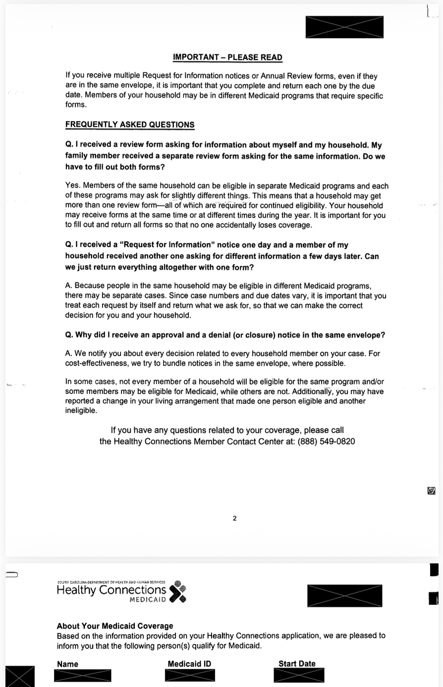
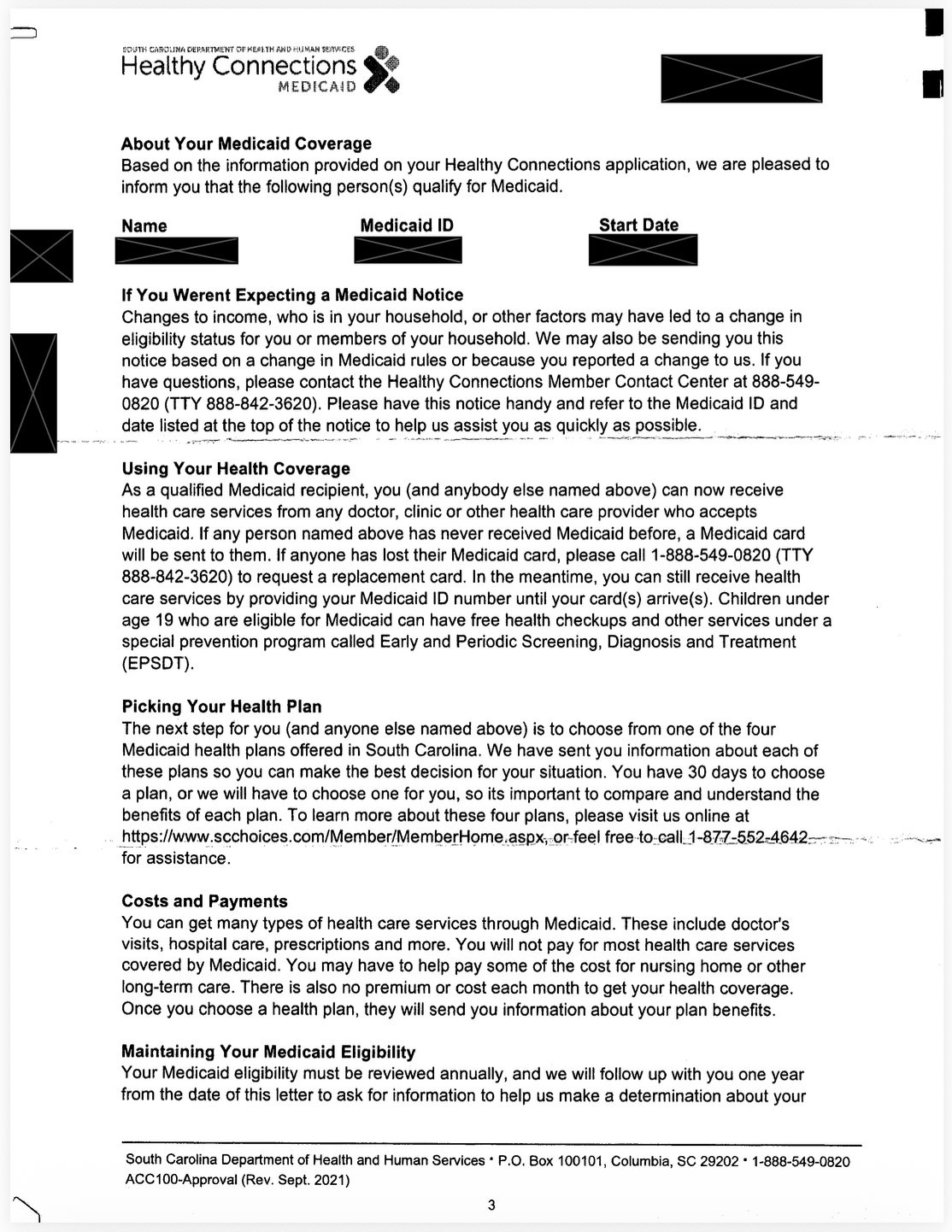
The pattern shows up in both directions. We've reviewed notices that devote the first two pages to FAQ content before disclosing, on page three, that the member's Medicaid coverage has been approved. We've also seen the reverse - notices that lead with reassuring approval language at the top and bury required next-step actions four pages in. That's the case Civilla documented in Michigan, where members read "approved" and assumed they were done but would lose coverage because they didn’t see the required next step.
Either direction is a buried-lede problem: the most important fact in the document is not where the eye lands first.
There's a defensible reason for this structure. Notices are drafted by lawyers and program staff who think in terms of establish the rule, then state the determination, then list the qualifications. Members don't read that way. They scan for the answer. If the answer isn't in the first paragraph, it often isn't found at all.
The fix is well-established: lead with the determination and the action. Your Medicaid coverage is approved through [DATE]. To keep it, do [X] by [DATE]. Everything else - the rule citation, the FAQ, the appeal rights - supports that lead. It does not precede it.
2. Undifferentiated envelopes are the first failure point
Most analysis of Medicaid notices focuses on what's inside the letter. The bigger problem is whether the letter gets opened at all.
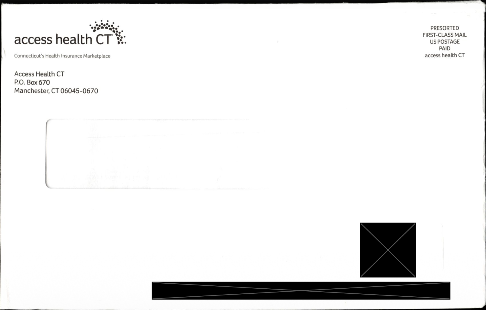
State Medicaid notices typically arrive in plain window envelopes from a P.O. box. The agency name (DHCS, DSS, or whatever the state calls it) is usually printed on the outside, but that's it. Rarely is there an "ACTION REQUIRED" marking or urgency cue at all. In a household that gets a stack of insurance, billing, and marketing mail every week, a Medicaid renewal notice could get sorted into the same pile as a hospital bill and a discount card from a vision plan.
It often doesn't get opened until weeks after it arrives - or at all.
An envelope that's visibly different — branded, colored, marked as time-sensitive — is at least harder to mistake for junk, which is why a state like Pennsylvania now mails its renewals in a large pink envelope (more on that below). But the stronger evidence sits one level in, in the mailing itself: simplifying the path to action measurably improves response. In a randomized study of subsidized health-insurance take-up in Massachusetts, an administrative simplification that gave people a streamlined way to enroll had a larger effect than either personalized or generic reminder letters. The interior redesign matters, but it's the second decision the member makes. The first is whether to open the envelope at all.
3. The member doesn't get one notice — they get a stream
A member up for renewal doesn't receive a single piece of correspondence. They receive the state renewal notice, the MCO renewal reminder, sometimes a federal Marketplace notice, a separate CHIP notice for any kids in the household, and a steady drip of MCO mailings about benefits, provider directories, satisfaction surveys, and pharmacy changes.
These come in different envelopes. They arrive in different orders. They reference different deadlines and different phone numbers. The MCO doesn't always know what the state sent. The state doesn't always know what the MCO sent. The household has to assemble the picture themselves.
A redesigned single notice - even an excellent one - gets dropped into this stream and competes for attention with everything else. The fix isn't just a better letter. It's a coordinated communication plan across the state, MCO, and federal sources, with a clear sequence and a single source of truth the member can return to.
4. Timing breaks before language does
Federal rules give members a real window to respond - at least 30 days to return a renewal form, and a reasonable period (generally around 30 days) to answer most follow-up requests for information. On paper that should be enough. The problem is that the window rarely arrives intact.
Start with the agency's own capacity. Federal law sets a 45-day deadline for processing applications, and during the unwinding many states missed it badly - in a single month, CMS data showed Texas, Montana, and several others completing 30% or more of their applications after the 45-day mark. Numbers like that signal a system stretched past its limits, and a stretched system has little room to mail notices on the early end of its internal timeline. That timing is what matters, because every notice counts its response window from the date it was mailed - not the date it lands in the mailbox.
Mail delivery eats the rest. First-class mail runs on a one-to-five business day standard, with cross-country mail at the far end of that range. A notice mailed on a tight internal timeline can reach a member with a meaningful chunk of the window already gone before they've even opened it. This is a structural problem that no amount of plain language fixes: a member who fully understands the notice still loses if it arrived too late to act on. The fix isn't clearer wording — it's building the timeline around when the notice realistically lands, and pairing mail with faster channels that don't depend on the postal calendar.
5. The action itself often isn't clear, even when members find it
Even when a member locates the part of the notice that tells them what to do, the instruction itself frequently isn't actionable. Four patterns recur:
Multiple competing signals for the same situation. A single notice may direct the member to call a phone number, mail a form, log into a portal, and visit a local office - without saying which path is required, which is preferred, or whether they're equivalent. Each route has its own friction. Members default to whichever looks easiest, which is often the one that doesn't actually fulfill the requirement. The same problem repeats visually: when the deadline, the phone number, the rule citation, the agency name, and the appeal rights are all bolded on the same page, none of them stands out. The member's eye has no hierarchy to follow. A clear notice names a single primary path and reserves emphasis for the single most important fact on the page.
Hedging that erases the actual ask. "You may need to provide proof of income" is not an instruction. "If you have changes in your household, you should report them" is not an instruction. Conditional language is often there for legal reasons - the agency doesn't want to commit to a definitive statement without knowing the case - but members read "may" as "this might not apply to me" and do nothing.
Missing operational details. A notice that says "submit your renewal documents" without specifying which documents, where to send them, in what format, and by when leaves the member with a research project rather than a task. Completion rates on tasks-that-are-actually-research-projects are low.
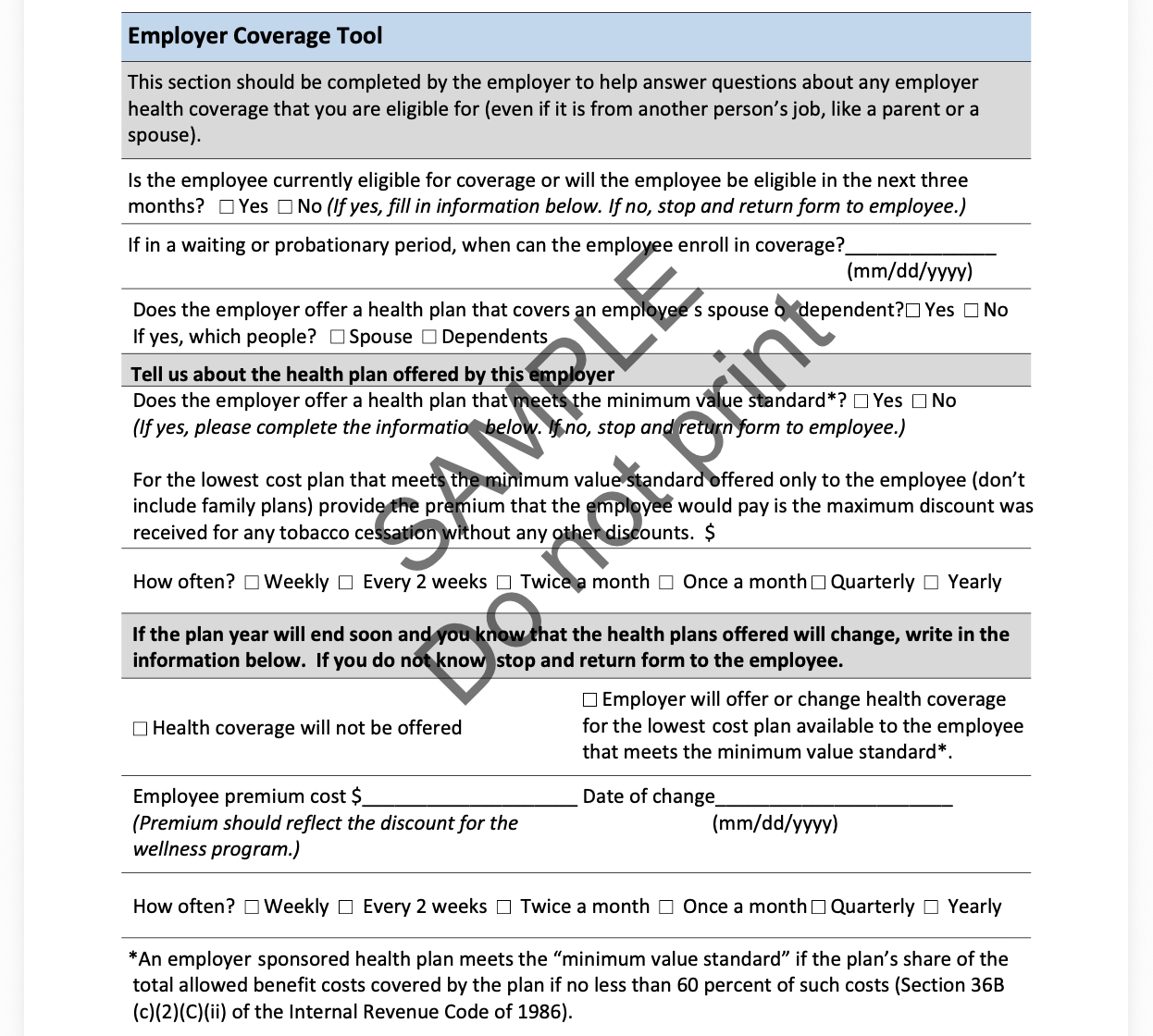
Unrealistic expectations of the member. Virginia's renewal form includes an "Employer Coverage Tool" in Appendix A - a page the applicant is instructed to take to their employer (or their parent's or spouse's employer) and have the employer fill out, with details about the employer's lowest-cost plan and whether it meets the federal minimum value standard.
The trigger condition is narrow - it applies only to households where someone has been offered employer coverage - but for that subset, the ask is significant: that the member knows who to talk to in HR, is comfortable flagging that they're enrolling in Medicaid, and can get the form completed and returned before the renewal deadline. The instruction itself is written clearly enough. It just asks for something most people will never actually do.
A clear action passes a simple test: a member should be able to read one sentence and know exactly what to do, where to do it, with what, and by when - without inferring anything. Most current notices fail that test.
6. Auto-renewal communications confuse members into acting unnecessarily
Ex parte renewal — where the state renews coverage automatically based on existing data — is the most effective coverage-retention tool available. States with high ex parte rates had dramatically lower procedural disenrollment during the unwinding.
But the notices members receive when they're auto-renewed often look almost identical to notices that require action. They reference renewal, deadlines, and required documents - even when no action is needed. Members read the word "renewal" and assume they need to do something. They call the state. They start uploading documents. In some cases they accidentally trigger a manual redetermination that puts their coverage at risk.
Auto-renewal notices need to say, in the first line, in larger type than anything else: You don't need to do anything. Your coverage continues. Most don't. The 2023 incident in which 30 states had to reinstate coverage for roughly 500,000 people erroneously disenrolled traced partly to ex parte processing and communication failures.
What a good notice — and a good notice system — actually looks like
The fixes are not mysterious. CMS itself revised its Marketplace eligibility notice in 2017 using plain language and improved layout, and reported fewer questions and complaints to its call center afterward. Civilla's redesign of Michigan's benefits application and renewal forms saved caseworker hours and improved completion. The principles are well-established at this point. Applied across the system rather than to a single letter, they look something like this:
One action, named clearly, with the operational details to act on it. "Renew your Medicaid by [DATE]" should be the first line of an action notice. The instruction itself should pass a simple test - a member should be able to read one sentence and know what to do, where to do it, with what, and by when. Hedging language like "you may need to" forces the member to do interpretive work the notice should have done. Auto-renewal notices, by contrast, should lead with "no action needed."
An envelope designed to be opened. Branded, urgency-cued, distinguishable from junk and from routine MCO mail. Pennsylvania is a good example here: the state's Department of Human Services mails Medicaid and CHIP renewal packets in a large pink envelope specifically so they stand out in the mail pile, paired with a public-facing "Look for the pink envelope" campaign reminding members what to watch for. It's one of the cheapest interventions available, and most states still don't do it.
A coordinated multi-channel plan, not a single letter. Mail for the legal record. SMS for the deadline reminder, with the actual action in the message, not "check your mail." Email for document upload links. A portal for completion tracking. Each channel does what it's good at; together they create redundancy that catches members who miss any one of them.
Timelines based on receive dates, not print dates. Build the response window from when the notice realistically arrives, not when it leaves the printer. If that means starting outreach earlier, start earlier.
A fallback when mail comes back. Returned mail should automatically trigger SMS, email, and MCO outreach instead of sitting in a database. The household needs to know someone is trying to reach them.
A way to confirm the loop is closed. The member should be able to see - and the plan and state should be able to see - whether the action was completed. Notices that disappear into the void after they're sent are how procedural disenrollments happen.
What plans can do now
Health plans don't control the state's notice, and they can't stand in for the state on eligibility; that determination is the agency's responsibility. What plans do control is everything that wraps around the notice: the welcome packet, the renewal reminder, the case manager outreach, the SMS prompts, the portal experience. Those are the touchpoints where a plan can reinforce the state's message and help members understand what's being asked of them.
The plans that retain members effectively through renewal cycles tend to do a few things consistently. They make sure their own contact information for members stays current and feed address updates back to the state, so the state's notice has a better chance of arriving. They proactively remind members that a renewal is coming and point them to the right place to complete it — the state portal, the county office, the helpline — rather than waiting to react after a disenrollment. And they meet members where they already are, using phone, text, and in-language outreach to explain what the notice means and connect people to help completing it, without taking over the eligibility process itself.
A notice is just a piece of paper. What determines whether someone keeps their coverage is everything that happens around it.